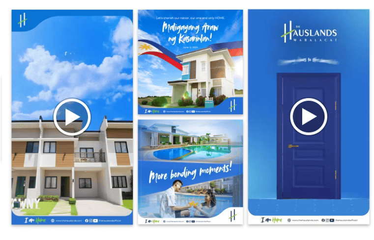
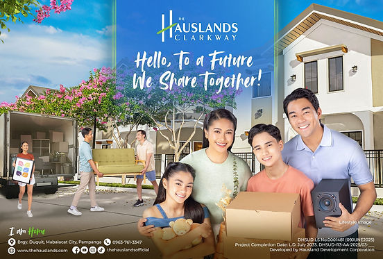
Say hello to a campaign that positions The Hauslands as a real estate powerhouse.
The Challenge
The Hauslands has a strong track record in building homes but also needed to strengthen brand recall and credibility.
It struggled to stand out against real estate giants because it didn’t have a unified look
The Abe-abe Solution
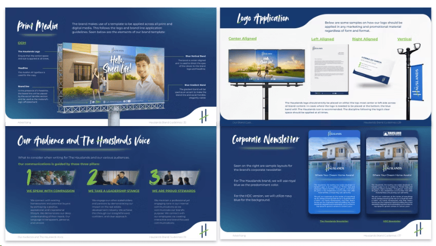
Abe-abe clarified and defined the visual language, tone, and personality of The Hauslands.
From logo use to color palette, messaging to typography, the brand was reshaped to ensure that every touchpoint reflected a unified, credible and professional look.
The Results
With its fresh, polished and distinct identity, is no longer just a local developer. It has become a trustworthy brand that now stands confidently alongside the country’s more established real estate brands.
Campaign Video
Brand Book
PR, Activation and Digital Content